mirror of
https://github.com/coder/coder.git
synced 2025-07-10 23:53:15 +00:00
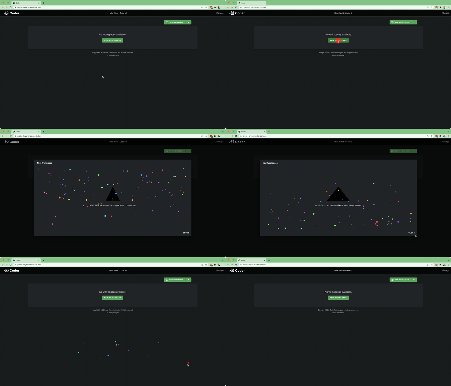
This is testing out [Approach 3](https://www.notion.so/coderhq/Workspaces-v2-Initial-UI-Scaffolding-3b07d2847eed48839a7e6f0f2bb9bf56#56256f25d2954897a8ee315f0820cedd) in the UI scaffolding RFC. Fixes https://github.com/coder/coder/issues/11 The folder structure looks like: - `site` - `components` (buttons, empty state, etc) - `pages` (large sections of UI -> composition of components) - `theme` (files defining our palette) Several components were able to be brought in essentially unmodified: - `SplitButton` - `EmptyState` - `Footer` - All the icons / logos - Theming (removed several items that aren't necessary, yet, though) Other components had more coupling, and need more refactoring: - `NavBar` - `Confetti` Current State:  For a full working app, there's potentially a lot more to bring in: - User / Account Settings Stuff - Users Page - Organizations Page (and all the supporting dependencies)
126 lines
3.7 KiB
TypeScript
126 lines
3.7 KiB
TypeScript
import Button, { ButtonProps } from "@material-ui/core/Button"
|
|
import ButtonGroup from "@material-ui/core/ButtonGroup"
|
|
import ClickAwayListener from "@material-ui/core/ClickAwayListener"
|
|
import Grow from "@material-ui/core/Grow"
|
|
import MenuItem from "@material-ui/core/MenuItem"
|
|
import MenuList from "@material-ui/core/MenuList"
|
|
import Paper from "@material-ui/core/Paper"
|
|
import Popper from "@material-ui/core/Popper"
|
|
import ArrowDropDownIcon from "@material-ui/icons/ArrowDropDown"
|
|
import React, { useRef, useState } from "react"
|
|
|
|
interface SplitButtonOptions<T> {
|
|
/**
|
|
* label is shown in the SplitButton UI
|
|
*/
|
|
label: string
|
|
/**
|
|
* value is any value for this option
|
|
*/
|
|
value: T
|
|
}
|
|
|
|
export interface SplitButtonProps<T> extends Pick<ButtonProps, "color" | "disabled" | "startIcon"> {
|
|
/**
|
|
* onClick is called with the selectedOption
|
|
*/
|
|
onClick: (selectedOption: T) => void
|
|
/**
|
|
* options is a list of options
|
|
*/
|
|
options: SplitButtonOptions<T>[]
|
|
/**
|
|
* textTransform is applied to the primary button text. Defaults to
|
|
* uppercase
|
|
*/
|
|
textTransform?: React.CSSProperties["textTransform"]
|
|
}
|
|
|
|
/**
|
|
* SplitButton is a button with a primary option and a dropdown with secondary
|
|
* options.
|
|
* @remark The primary option is the 0th index (first option) in the array.
|
|
* @see https://mui.com/components/button-group/#split-button
|
|
*/
|
|
export const SplitButton = <T,>({
|
|
color,
|
|
disabled,
|
|
onClick,
|
|
options,
|
|
startIcon,
|
|
textTransform,
|
|
}: SplitButtonProps<T>): ReturnType<React.FC> => {
|
|
const [isPopperOpen, setIsPopperOpen] = useState<boolean>(false)
|
|
|
|
const anchorRef = useRef<HTMLDivElement>(null)
|
|
const displayedLabel = options[0].label
|
|
|
|
const handleClick = () => {
|
|
onClick(options[0].value)
|
|
}
|
|
const handleClose = (e: React.MouseEvent<Document, MouseEvent>) => {
|
|
if (anchorRef.current && anchorRef.current.contains(e.target as HTMLElement)) {
|
|
return
|
|
}
|
|
setIsPopperOpen(false)
|
|
}
|
|
const handleSelectOpt = (e: React.MouseEvent<HTMLLIElement, MouseEvent>, opt: number) => {
|
|
onClick(options[opt].value)
|
|
setIsPopperOpen(false)
|
|
}
|
|
const handleTogglePopper = () => {
|
|
setIsPopperOpen((prevOpen) => !prevOpen)
|
|
}
|
|
|
|
return (
|
|
<>
|
|
<ButtonGroup aria-label="split button" color={color} ref={anchorRef} variant="contained">
|
|
<Button disabled={disabled} onClick={handleClick} startIcon={startIcon} style={{ textTransform }}>
|
|
{displayedLabel}
|
|
</Button>
|
|
<Button
|
|
aria-controls={isPopperOpen ? "split-button-menu" : undefined}
|
|
aria-expanded={isPopperOpen ? "true" : undefined}
|
|
aria-label="select merge strategy"
|
|
aria-haspopup="menu"
|
|
disabled={disabled}
|
|
size="small"
|
|
onClick={handleTogglePopper}
|
|
>
|
|
<ArrowDropDownIcon />
|
|
</Button>
|
|
</ButtonGroup>
|
|
|
|
<Popper
|
|
anchorEl={anchorRef.current}
|
|
disablePortal
|
|
open={isPopperOpen}
|
|
role={undefined}
|
|
style={{ zIndex: 1 }}
|
|
transition
|
|
>
|
|
{({ TransitionProps, placement }) => (
|
|
<Grow
|
|
{...TransitionProps}
|
|
style={{
|
|
transformOrigin: placement === "bottom" ? "center top" : "center bottom",
|
|
}}
|
|
>
|
|
<Paper>
|
|
<ClickAwayListener onClickAway={handleClose}>
|
|
<MenuList id="split-button-menu">
|
|
{options.map((opt, idx) => (
|
|
<MenuItem key={opt.label} onClick={(e) => handleSelectOpt(e, idx)}>
|
|
{opt.label}
|
|
</MenuItem>
|
|
))}
|
|
</MenuList>
|
|
</ClickAwayListener>
|
|
</Paper>
|
|
</Grow>
|
|
)}
|
|
</Popper>
|
|
</>
|
|
)
|
|
}
|