mirror of
https://github.com/coder/coder.git
synced 2025-07-12 00:14:10 +00:00
 ace89161fb
This is testing out [Approach 3](https://www.notion.so/coderhq/Workspaces-v2-Initial-UI-Scaffolding-3b07d2847eed48839a7e6f0f2bb9bf56#56256f25d2954897a8ee315f0820cedd) in the UI scaffolding RFC. Fixes https://github.com/coder/coder/issues/11 The folder structure looks like: - `site` - `components` (buttons, empty state, etc) - `pages` (large sections of UI -> composition of components) - `theme` (files defining our palette) Several components were able to be brought in essentially unmodified: - `SplitButton` - `EmptyState` - `Footer` - All the icons / logos - Theming (removed several items that aren't necessary, yet, though) Other components had more coupling, and need more refactoring: - `NavBar` - `Confetti` Current State: 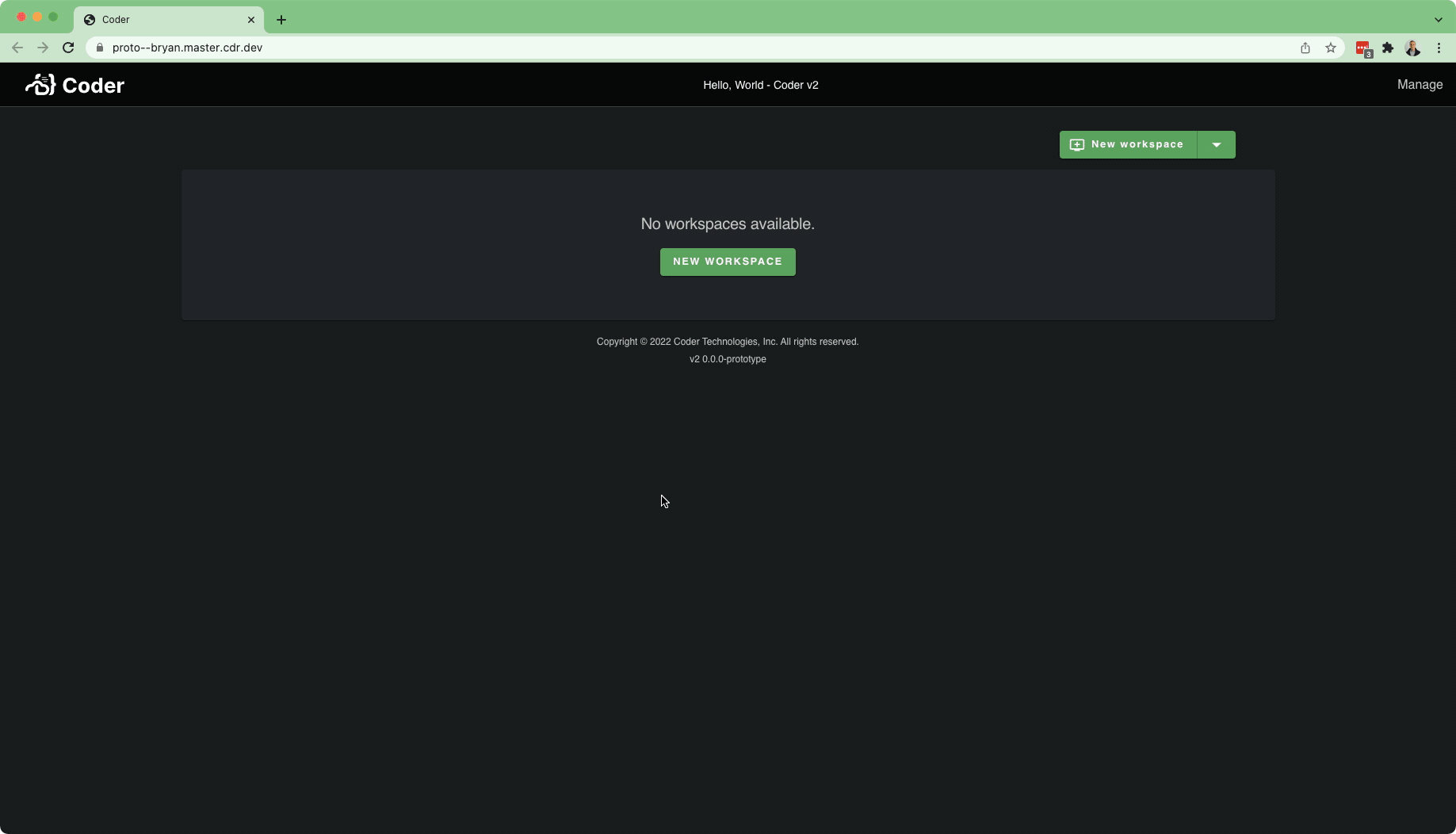 For a full working app, there's potentially a lot more to bring in: - User / Account Settings Stuff - Users Page - Organizations Page (and all the supporting dependencies)
75 lines
2.3 KiB
TypeScript
75 lines
2.3 KiB
TypeScript
import React from "react"
|
|
import { makeStyles } from "@material-ui/core/styles"
|
|
import Box from "@material-ui/core/Box"
|
|
import Button, { ButtonProps } from "@material-ui/core/Button"
|
|
import Typography from "@material-ui/core/Typography"
|
|
|
|
export interface EmptyStateProps {
|
|
/** Text Message to display, placed inside Typography component */
|
|
message: React.ReactNode
|
|
/** Longer optional description to display below the message */
|
|
description?: React.ReactNode
|
|
button?: ButtonProps
|
|
}
|
|
|
|
/**
|
|
* Component to place on screens or in lists that have no content. Optionally
|
|
* provide a button that would allow the user to return from where they were,
|
|
* or to add an item that they currently have none of.
|
|
*
|
|
* EmptyState's props extend the [Material UI Box component](https://material-ui.com/components/box/)
|
|
* that you can directly pass props through to to customize the shape and layout of it.
|
|
*/
|
|
export const EmptyState: React.FC<EmptyStateProps> = (props) => {
|
|
const { message, description, button, ...boxProps } = props
|
|
const styles = useStyles()
|
|
|
|
const descClassName = `${styles.description}`
|
|
const buttonClassName = `${styles.button} ${button && button.className ? button.className : ""}`
|
|
|
|
return (
|
|
<Box className={styles.root} {...boxProps}>
|
|
<Typography variant="h5" color="textSecondary" className={styles.header}>
|
|
{message}
|
|
</Typography>
|
|
{description && (
|
|
<Typography variant="body2" color="textSecondary" className={descClassName}>
|
|
{description}
|
|
</Typography>
|
|
)}
|
|
{button && <Button variant="contained" color="primary" {...button} className={buttonClassName} />}
|
|
</Box>
|
|
)
|
|
}
|
|
|
|
const useStyles = makeStyles(
|
|
(theme) => ({
|
|
root: {
|
|
display: "flex",
|
|
flexDirection: "column",
|
|
justifyContent: "center",
|
|
alignItems: "center",
|
|
textAlign: "center",
|
|
minHeight: 120,
|
|
padding: theme.spacing(3),
|
|
},
|
|
header: {
|
|
fontWeight: 400,
|
|
},
|
|
description: {
|
|
marginTop: theme.spacing(2),
|
|
marginBottom: theme.spacing(1),
|
|
},
|
|
button: {
|
|
marginTop: theme.spacing(2),
|
|
},
|
|
icon: {
|
|
fontSize: theme.typography.h2.fontSize,
|
|
color: theme.palette.text.secondary,
|
|
marginBottom: theme.spacing(1),
|
|
opacity: 0.5,
|
|
},
|
|
}),
|
|
{ name: "EmptyState" },
|
|
)
|