mirror of
https://github.com/coder/coder.git
synced 2025-07-12 00:14:10 +00:00
 b964cb0380
This implements a simple Project listing page at `/projects` - just a table for a list of projects: 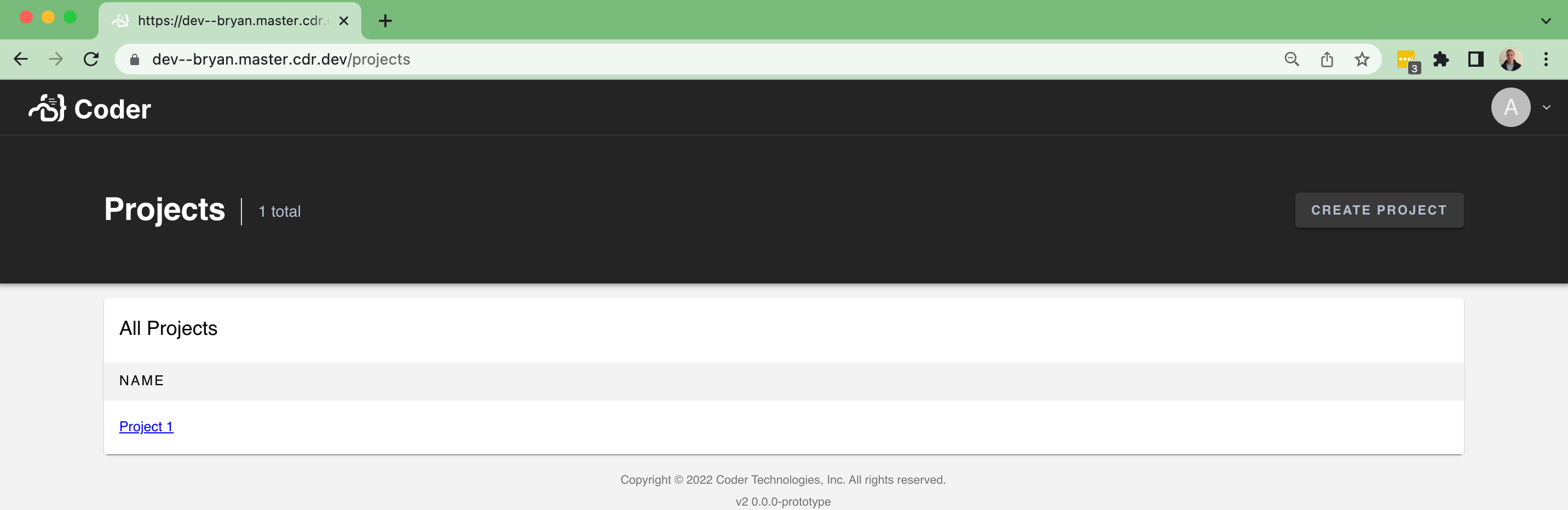 ...and an empty state: 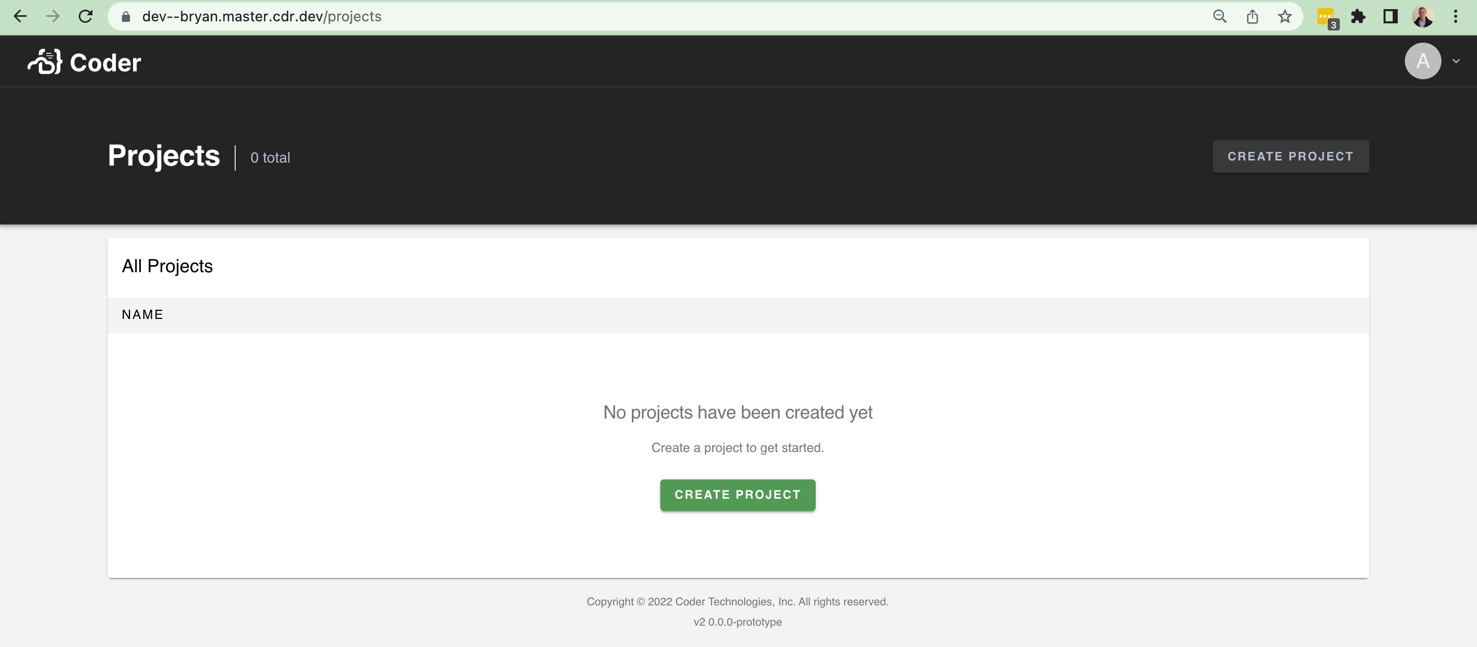 There isn't too much data to show at the moment. It'll be nice in the future to show the following fields and improve the UI with it: - An icon - A list of users using the project - A description However, this brings in a lot of scaffolding to make it easier to build pages like this (`/organizations`, `/workspaces`, etc). In particular, I brought over a few things from v1: - The `Hero` / `Header` component at the top of pages + sub-components - A `Table` component for help rendering table-like UI + sub-components - Additional palette settings that the `Hero`
38 lines
886 B
TypeScript
38 lines
886 B
TypeScript
import Button from "@material-ui/core/Button"
|
|
import { lighten, makeStyles } from "@material-ui/core/styles"
|
|
import React from "react"
|
|
|
|
export interface HeaderButtonProps {
|
|
readonly text: string
|
|
readonly disabled?: boolean
|
|
readonly onClick?: (event: MouseEvent) => void
|
|
}
|
|
|
|
export const HeaderButton: React.FC<HeaderButtonProps> = (props) => {
|
|
const styles = useStyles()
|
|
|
|
return (
|
|
<Button
|
|
className={styles.pageButton}
|
|
variant="contained"
|
|
onClick={(event: React.MouseEvent): void => {
|
|
if (props.onClick) {
|
|
props.onClick(event.nativeEvent)
|
|
}
|
|
}}
|
|
disabled={props.disabled}
|
|
component="button"
|
|
>
|
|
{props.text}
|
|
</Button>
|
|
)
|
|
}
|
|
|
|
const useStyles = makeStyles((theme) => ({
|
|
pageButton: {
|
|
whiteSpace: "nowrap",
|
|
backgroundColor: lighten(theme.palette.hero.main, 0.1),
|
|
color: "#B5BFD2",
|
|
},
|
|
}))
|