mirror of
https://github.com/coder/coder.git
synced 2025-07-12 00:14:10 +00:00
 b964cb0380
This implements a simple Project listing page at `/projects` - just a table for a list of projects: 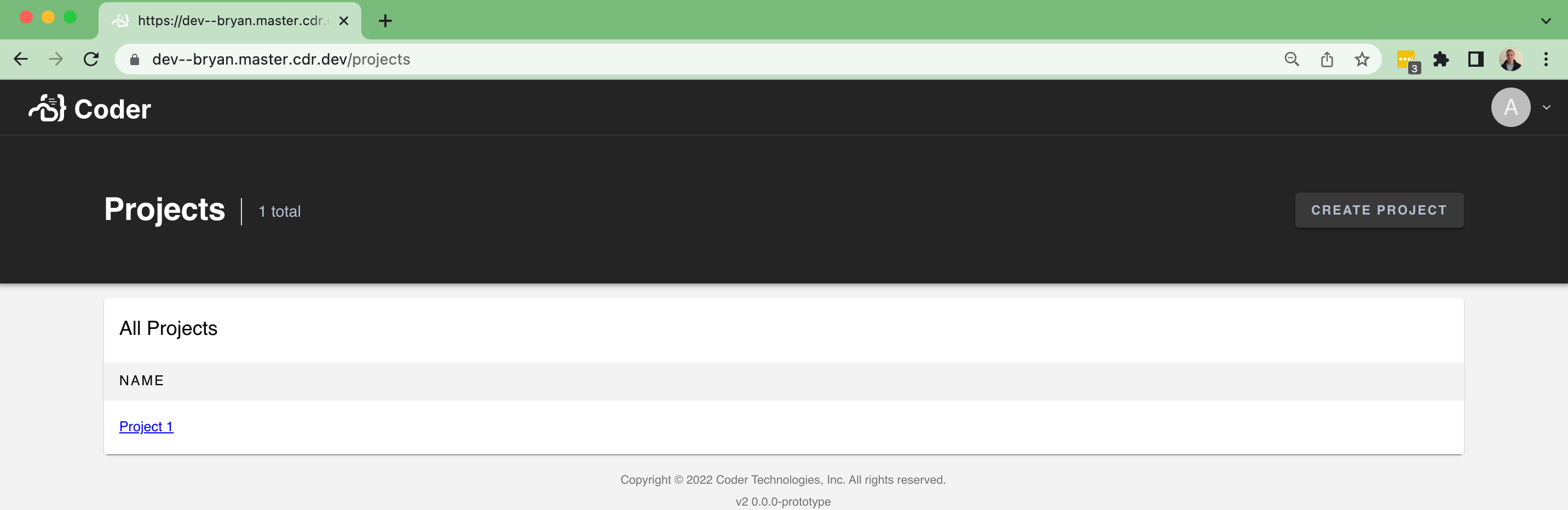 ...and an empty state: 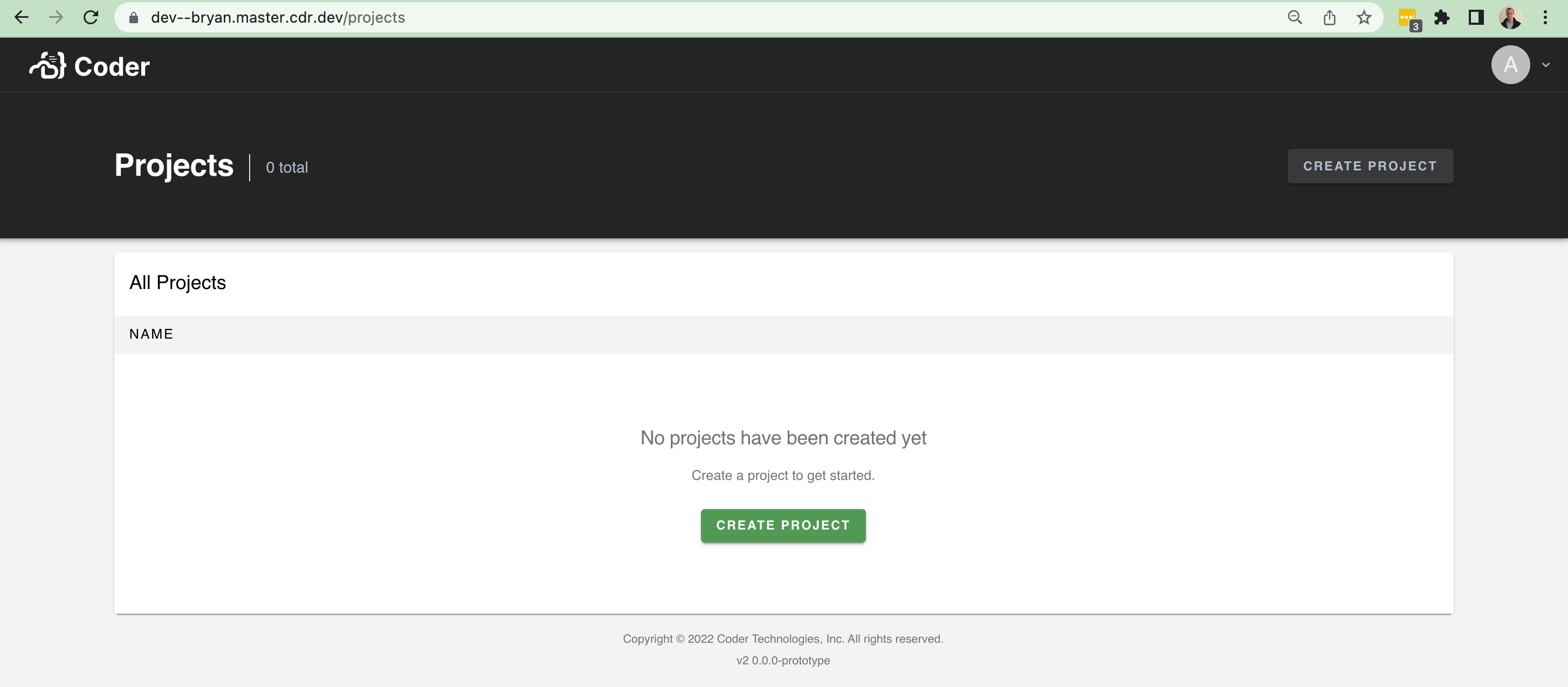 There isn't too much data to show at the moment. It'll be nice in the future to show the following fields and improve the UI with it: - An icon - A list of users using the project - A description However, this brings in a lot of scaffolding to make it easier to build pages like this (`/organizations`, `/workspaces`, etc). In particular, I brought over a few things from v1: - The `Hero` / `Header` component at the top of pages + sub-components - A `Table` component for help rendering table-like UI + sub-components - Additional palette settings that the `Hero`
117 lines
2.9 KiB
TypeScript
117 lines
2.9 KiB
TypeScript
import Box from "@material-ui/core/Box"
|
|
import Typography from "@material-ui/core/Typography"
|
|
import { makeStyles } from "@material-ui/core/styles"
|
|
import React from "react"
|
|
import { HeaderButton } from "./HeaderButton"
|
|
|
|
export interface HeaderAction {
|
|
readonly text: string
|
|
readonly onClick?: (event: MouseEvent) => void
|
|
}
|
|
|
|
export interface HeaderProps {
|
|
description?: string
|
|
title: string
|
|
subTitle?: string
|
|
action?: HeaderAction
|
|
}
|
|
|
|
export const Header: React.FC<HeaderProps> = ({ description, title, subTitle, action }) => {
|
|
const styles = useStyles()
|
|
|
|
return (
|
|
<div className={styles.root}>
|
|
<div className={styles.top}>
|
|
<div className={styles.topInner}>
|
|
<Box display="flex" flexDirection="column" minWidth={0}>
|
|
<div>
|
|
<Box display="flex" alignItems="center">
|
|
<Typography variant="h3" className={styles.title}>
|
|
<Box component="span" maxWidth="100%" overflow="hidden" textOverflow="ellipsis">
|
|
{title}
|
|
</Box>
|
|
</Typography>
|
|
|
|
{subTitle && (
|
|
<div className={styles.subtitle}>
|
|
<Typography style={{ fontSize: 16 }}>{subTitle}</Typography>
|
|
</div>
|
|
)}
|
|
</Box>
|
|
{description && (
|
|
<Typography variant="caption" className={styles.description}>
|
|
{description}
|
|
</Typography>
|
|
)}
|
|
</div>
|
|
</Box>
|
|
|
|
{action && (
|
|
<>
|
|
<div className={styles.actions}>
|
|
<HeaderButton key={action.text} {...action} />
|
|
</div>
|
|
</>
|
|
)}
|
|
</div>
|
|
</div>
|
|
</div>
|
|
)
|
|
}
|
|
|
|
const secondaryText = "#B5BFD2"
|
|
const useStyles = makeStyles((theme) => ({
|
|
root: {},
|
|
top: {
|
|
position: "relative",
|
|
display: "flex",
|
|
alignItems: "center",
|
|
height: 150,
|
|
background: theme.palette.hero.main,
|
|
boxShadow: theme.shadows[3],
|
|
},
|
|
topInner: {
|
|
display: "flex",
|
|
alignItems: "center",
|
|
maxWidth: "1380px",
|
|
margin: "0 auto",
|
|
flex: 1,
|
|
height: 68,
|
|
minWidth: 0,
|
|
},
|
|
title: {
|
|
display: "flex",
|
|
alignItems: "center",
|
|
fontWeight: "bold",
|
|
whiteSpace: "nowrap",
|
|
minWidth: 0,
|
|
color: theme.palette.primary.contrastText,
|
|
},
|
|
description: {
|
|
display: "block",
|
|
marginTop: theme.spacing(1) / 2,
|
|
marginBottom: -26,
|
|
color: secondaryText,
|
|
},
|
|
subtitle: {
|
|
position: "relative",
|
|
top: 2,
|
|
display: "flex",
|
|
alignItems: "center",
|
|
borderLeft: `1px solid ${theme.palette.divider}`,
|
|
height: 28,
|
|
marginLeft: 16,
|
|
paddingLeft: 16,
|
|
color: secondaryText,
|
|
},
|
|
actions: {
|
|
paddingLeft: "50px",
|
|
paddingRight: 0,
|
|
flex: 1,
|
|
display: "flex",
|
|
flexDirection: "row",
|
|
justifyContent: "flex-end",
|
|
alignItems: "center",
|
|
},
|
|
}))
|