mirror of
https://github.com/coder/coder.git
synced 2025-07-12 00:14:10 +00:00
 b964cb0380
This implements a simple Project listing page at `/projects` - just a table for a list of projects: 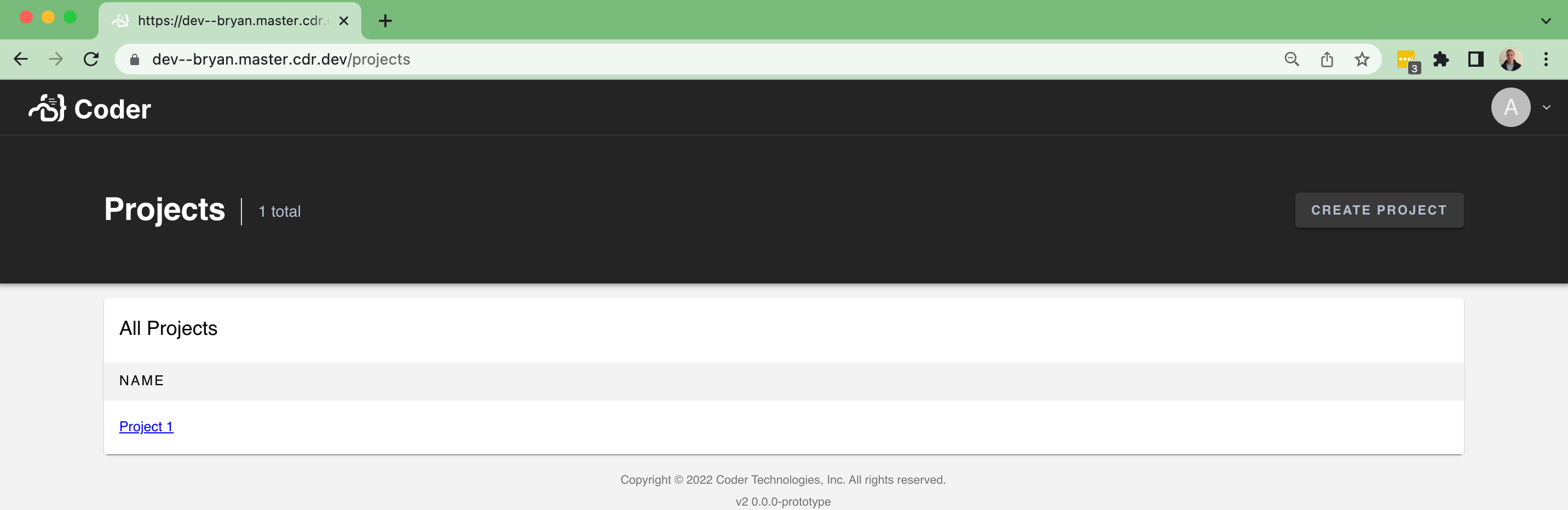 ...and an empty state: 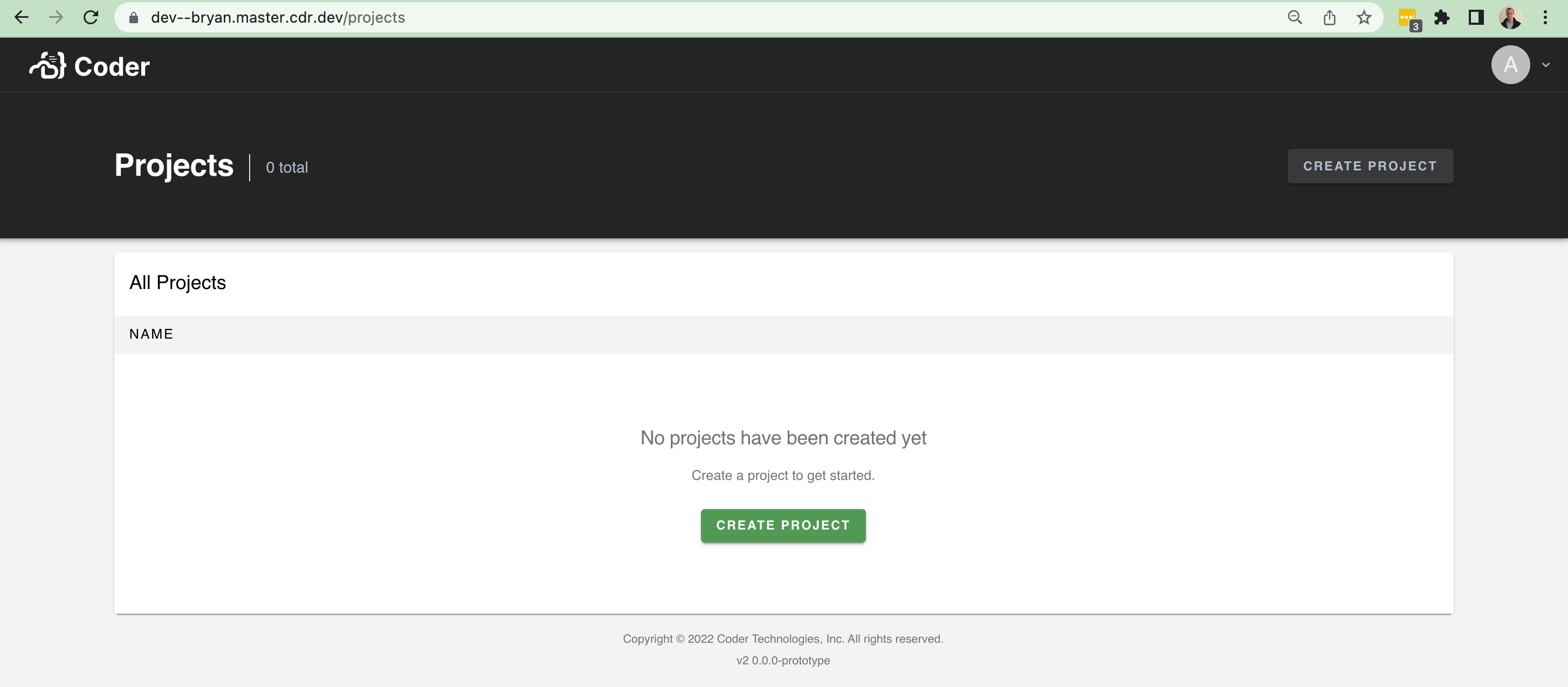 There isn't too much data to show at the moment. It'll be nice in the future to show the following fields and improve the UI with it: - An icon - A list of users using the project - A description However, this brings in a lot of scaffolding to make it easier to build pages like this (`/organizations`, `/workspaces`, etc). In particular, I brought over a few things from v1: - The `Hero` / `Header` component at the top of pages + sub-components - A `Table` component for help rendering table-like UI + sub-components - Additional palette settings that the `Hero`
36 lines
897 B
TypeScript
36 lines
897 B
TypeScript
import React from "react"
|
|
import TableCell from "@material-ui/core/TableCell"
|
|
import TableRow from "@material-ui/core/TableRow"
|
|
import { makeStyles } from "@material-ui/core/styles"
|
|
|
|
export interface TableHeadersProps {
|
|
columns: string[]
|
|
}
|
|
|
|
export const TableHeaders: React.FC<TableHeadersProps> = ({ columns }) => {
|
|
const styles = useStyles()
|
|
return (
|
|
<TableRow className={styles.root}>
|
|
{columns.map((c, idx) => (
|
|
<TableCell key={idx} size="small">
|
|
{c}
|
|
</TableCell>
|
|
))}
|
|
</TableRow>
|
|
)
|
|
}
|
|
|
|
export const useStyles = makeStyles((theme) => ({
|
|
root: {
|
|
fontSize: 12,
|
|
fontWeight: 500,
|
|
lineHeight: "16px",
|
|
letterSpacing: 1.5,
|
|
textTransform: "uppercase",
|
|
paddingTop: theme.spacing(1),
|
|
paddingBottom: theme.spacing(1),
|
|
color: theme.palette.text.secondary,
|
|
backgroundColor: theme.palette.background.default,
|
|
},
|
|
}))
|